Ten Secrets On Creating A Book Cover That Attracts The Masses
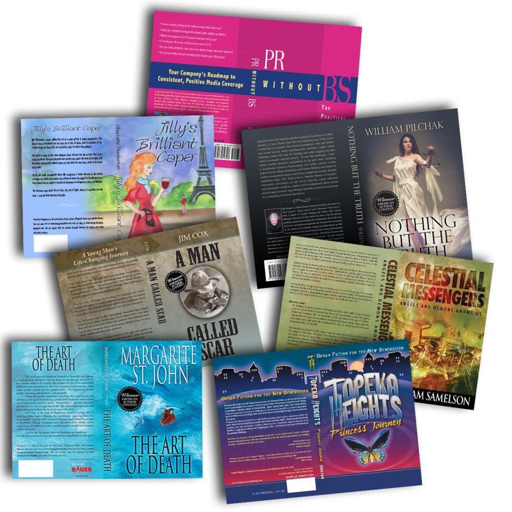
The cover is the face of your book: Coveted tips from a professional book cover designer on how to make that first (and successful) impression
Don’t clutter your cover
Keep it simple and focused. You have to grab the book browsers attention NOW. In a world full of graphic pollution, less is more. If your front cover is full of photos, text, or fancy fonts, it will be too much information to compute and it won’t get noticed. Think in terms of billboards to drivers. Your book cover needs to be absolutely clear and understood in 6 seconds or less. On the web, it needs to be legible and well read at thumbnail size. When perusing books, the viewer will see either your spine or front cover first. Then if they like what they see, they will flip it over and read the back. Keep your book’s back page description down to 3 paragraphs.
Keep your title short and large
A good rule of thumb is a two-to-three word title; with an optional smaller one-line sub-title. Avoid fancy script fonts that don’t reduce clearly. Use san-seriffed or semi-seriffed fonts. The spine should be readable five feet away.
Choose a high resolution image
If you decide to use an image on your cover, make sure that you pick a very high quality image that will look great on any device or after print. You want your cover to be crisp and professional and not blurry or pixelated. It is relativity easy to find great quality stock images on the internet.
Keep your color scheme simple
Imagine designing a book cover like you would paint a home: A base color, trim color, and embellishment color. The colors should complement each other and work with the image. Go for contrast and complement the context: Black backgrounds with white text for example is dramatic; mysterious—Murder mysteries, dark romance. Bolder colors make a profound statement. Pastel or lighter colors imply a lighter, happier tone.
Research book covers in your genre
Go to Amazon and peruse the top-selling books and see what stands out, what qualities do the bestsellers share, and what grabs your attention. Another great place to look for book cover designs is Pinterest. You will be surprised how how many pins come up from just searching “Book Cover Designs”.
Big name mentions
If you can obtain a foreword or blurb by a famous person or popular trade magazine, give it a prominent place on your front cover – but shorten it if it’s too long. This gives instant credibility and has an immediate positive effect.
Create a few versions
When you have an idea for your cover, create a couple of variations of it. Print them off and lay them side by side. Which do you like the best? It may be that you even like elements from each that you can incorporate into your final design.
The flaps count
For book jackets, don’t overlook the selling potential of the flaps. Consumers typically read the front, spine, back, then open up to the flaps for more information. Here is a great place for your bio, other books you’ve written, website, etc.
Give yourself a review
Print out your cover on a full color printer to gain perspective on what the consumer will see. Set it 5-10 feet away. Is it legible? Clean? Does it grab attention out of the corner of your eye?
Friends & Family
Give your cover to your most scrupulous circle, and get their honest opinion. Would they buy this book based on the cover alone? What are their suggestions?